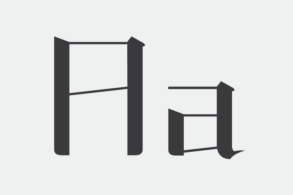
Chinoce
Chinoce is a typeface inspired by a modern serif Chinese font printed on a book cover. The unique thick and thins of the strokes, as well as its distinctive curved serifs are appropriated and stylized to adapt the blockish feel of the Chinese written characters. One of the challenges in designing the typeface is to give it an Eastern quality while maintaining its legibility. I carefully analyzed each individual stroke that make up theChinese characters and incorporated its unique characteristics in constructing my lettterforms. Chinoce has slanted serifs and lower-than-usual horizontal strokes, along with overshoots that are higher than normal. The equal width and height of the letters give them a short and wide look to mimic the blocky feel of the Chinese characters. In addition, spacing and kerning are specifically looked after to ensure that Chinoce is not just a typeface that looks good in large sizes. I made careful adjustments after reviewing the relationships between each letters in a variety of combinations, including the most common initial caps, upper and upper case pairs, upper and lower case pairs, and lower and lower case pairs. Strong attention has also been paid to the details of each designed character, where all extra points have been removed to establish the smoothness of the curves.
- Typography Design


Leave a Reply